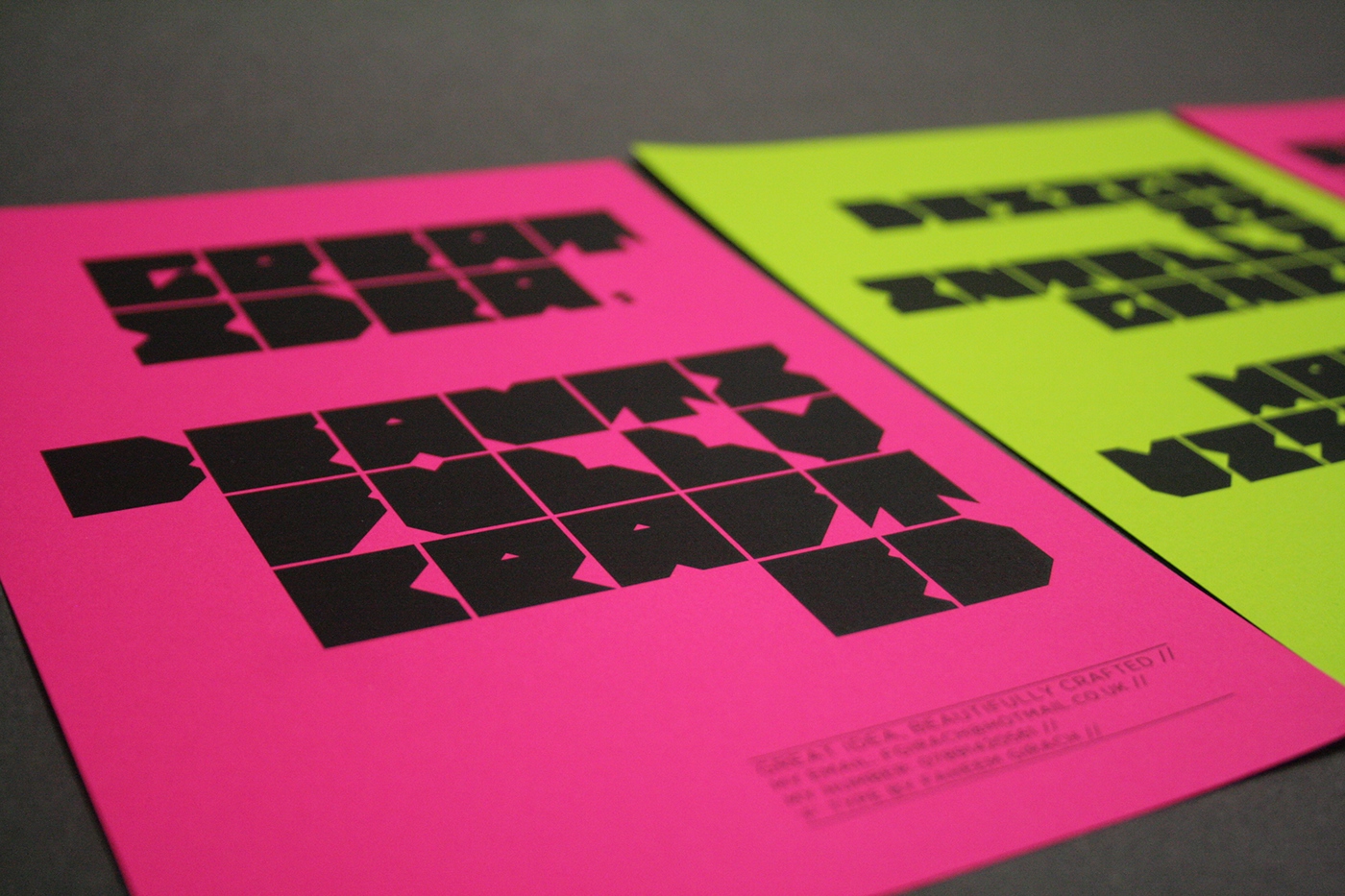
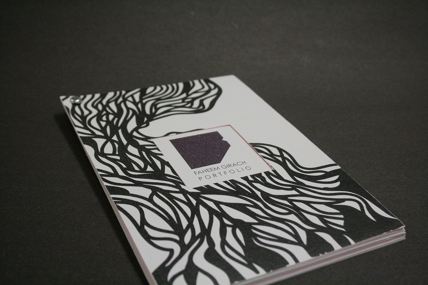

The ‘F’ was developed through my love of blocky typeface and everything having to be equal. The basis of each letter is a square, because it can be divided equally, has equal corners and sides and is the same on both the sides. The colour palette has developed from the previous just black and white because it didn’t relate back to my colourful personality. I love neon and bright colours and these have now become part of my brand. I felt my brand becoming much more quirky. This is where my expensive habit of neon colours developed, with a lot of my personal collateral being printed on this. Patterns have also been something that has become part of my personal identity, which has been influenced by my Indian heritage and something I can’t avoid as it is always boldly present.

